Monday, November 14, 2005

The New Old Busch Stadium


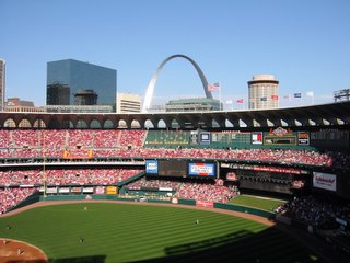
They're building a new baseball stadium for the St. Louis Cardinals. It will be ready for the 2006 season and will also be called Busch Stadium. The old Busch Stadium built in the 1960's was a modern structure inspired by the then new St. Louis Arch. The Arch is the most beautiful Modernist Monument in the world. Cutting edge in every way. I love the Arch and loved that the stadium reflected the style of the Arch. There was a cohesiveness to the two structures. It gave the city an identifiable character.
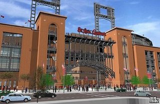
The new stadium is one of the retro style stadiums that have been built around the country over the last decade. This stadium is taking inspiration from another St. Louis landmark, Eads Bridge. This is a structure that was also cutting edge for it's day. That day, however, was the 1860's.

I'm sure the new stadium will be swell. It'll have modern amenities and feel architecturally cozy and old fashioned with it's faux brick exterior. People may say that it takes them back to when they were a kid at the old Sportsman's Park. I'm not sure this is a good thing. When do we move forward? When do we get the flying cars we were promised as kids? When do the cops get ray guns that'll stop you in your tracks rather than put 12 bullets in you?

Please don't misunderstand me. I'm a huge fan of old buildings. I don't think we should ever tear one down. They are precious reminders of a different era. An era when things were built with an attention to detail. Save the old buildings! In instances where a new building is being put on an empty lot, however, we should not try and build an old looking building. It's an insult to the designers and tradesman who made the old buildings. We should build something equally as cutting edge. We should be designing pneumatic tubes or transporters to move people around. That would be as cutting edge as elevators were in the 1890's.

People like old things. Retro is fashionable. Designers seem to be basing their designs on old fashioned items. Look at kitchen appliances now. All of the coolest contemporary ones look like they were made in the 50's. The toasters you buy now look like the one in your Grandma's kitchen when you were a kid.

The new Ford Mustang is another example. Ford created, and has been very successful in selling, a new Mustang that looks like it was built in 1969. I think it's pretty cool too. But Ford is not breaking new boundries. They did not create the Honda Insight or the Toyota Prius because they were too busy looking backwards. We need to look forward as a society. That is what Modernism is all about.

Architects, artists, designers help to shape our society. They move us forward. They show us that the past is no longer with us and that we are moving toward the future together. Or at least they are showing Asians and Europeans they are moving toward the future together. American designers are showing us that it's 1950 all over again. I hope everyone is comfortable in that.

W.W.E.S.B.? What would Eero Saarinen build?

Sunday, November 13, 2005

Fashion confused

I love Fall (or Autumn if you prefer). It's a great time of year. There are overlap seasons though. There should be a name for the seasons that are between the 4 seasons. Right now it's mid November but it is 80 degrees (Indian Summer?). It's funny to go to public places and see how everyone is dressed. Some people dress for November. They picked up their new sweater and leather jacket in August and couldn't wait any longer to wear them. They're out in turtlenecks and jeans and have got to be uncomfortable. Some people dress for the temperature and are out in shorts and t-shirts. It's funny to get them in the same place. I wonder if they know how awkward they look together. If anyone snaps a good secret picture of fashion confused people please send them to me so I can post. stlstuff at sbcglobal dot net

Sunday, November 06, 2005

New Life

Rehabbing: The house is coming along. I had one setback this week with my shower. I have a custom sized shower. It's 8 feet x 3 feet with a seat at either end. I need to have a custom shower floor made that slopes towards the drain. It's pretty important that water doesn't pool or leak below so I wanted to leave it to a professional. After having 4 "professionals" out to look at it and either give me a really high bid or not bother to get back to me at all I've decided to do it myself. This was the last thing I wanted to do, but I think in the end I'll be really proud to have done it myself.

I've also had a difficult time finding someone to install my kitchen/flex room floor. It's the entire back of the house and we wanted to do a sheet Congoleum in black. It would look very industrial and not have many seams which would leave fewer places for dirt to hide. After bids in the $4,000 range I called a place nearby in the city. The guy talked me out of the sheet material because it's going over a wood floor and not something more stable like concrete. He said tiles would work better because they have more flex to them. He also gave me a bid of $1,600 which made it easy for me to make the decision. So in the end we are going with an all black Congoleum tile floor.

Throughout this project I've had a mantra. It's "simplify and black". With any decision that needs to be made I think of ways to simplify the look which I believe will give me a more modern feel or I wonder if black would be appropriate. The doorknobs are all black enamel and that inspired the black thinking. Example: Picking wall colors. Black is not appropriate. So I thought of ways to simplify. In the end we are painting the trim and walls the same color (different finishes but the same color). This cuts down on the number of color decisions that need to be made (simplyfying my life) and it unifies the rooms making the space feel larger. This is pretty common in "modern" homes and I think it'll make our historic home feel more contemporary.

I also needed to make a decision about tile for the entryway. We had all of our wood floors refinished, but there was a space next to the front door that had different flooring that had been removed. I thought of my mantra and it made the decision easy. I ordered some flat black ceramic tiles with onyx colored grout. In the end it will be very elegant and tie in with the black floor in the kitchen at the back of the house. In a future project I'll probably have an alternate mantra (sunflowers and shiny? rectangles and stone?), but having a simple plan helps keep the project cohesive.

So, the shower not being done is holding up a lot of the finish plumbing and the kitchen floor not being done is holding up cabinet installation. Both of these things should be completed this week which would be a big step towards the completion of the project! Yippee.

Movies: We haven't been to the theater since having the baby, but we did rent a movie last night that was really interesting. The dvd was Millions directed by Danny Boyle of Trainspotting and 28 Days Later fame. It was unpredictable which is one of my 2 criteria* for enjoying a movie.


*My movie enjoying criteria: 1) The movie has to be unpredictable. If I know what is going to happen before it happens then the filmmakers didn't do a very good job. 2) It must show me a world into which I would not otherwise see. That world could be the world of my next door neighbor, but it would have to be an aspect of their life that I wouldn't see if it wasn't for the film. Movies can meet either or both of these criteria and I will usually enjoy some aspect of them. It would be the rare film that doesn't meet either criteria and I would still enjoy it.